WhatsApp has started introducing a visual refresh on iOS that shifts the app toward a glass-style interface. The update brings layered transparency, soft blur, and floating UI elements across multiple parts of the app.
Instead of flat panels and solid backgrounds, the new design relies on depth and translucency. The change is subtle but noticeable during everyday interactions like opening menus, switching tabs, or navigating settings.
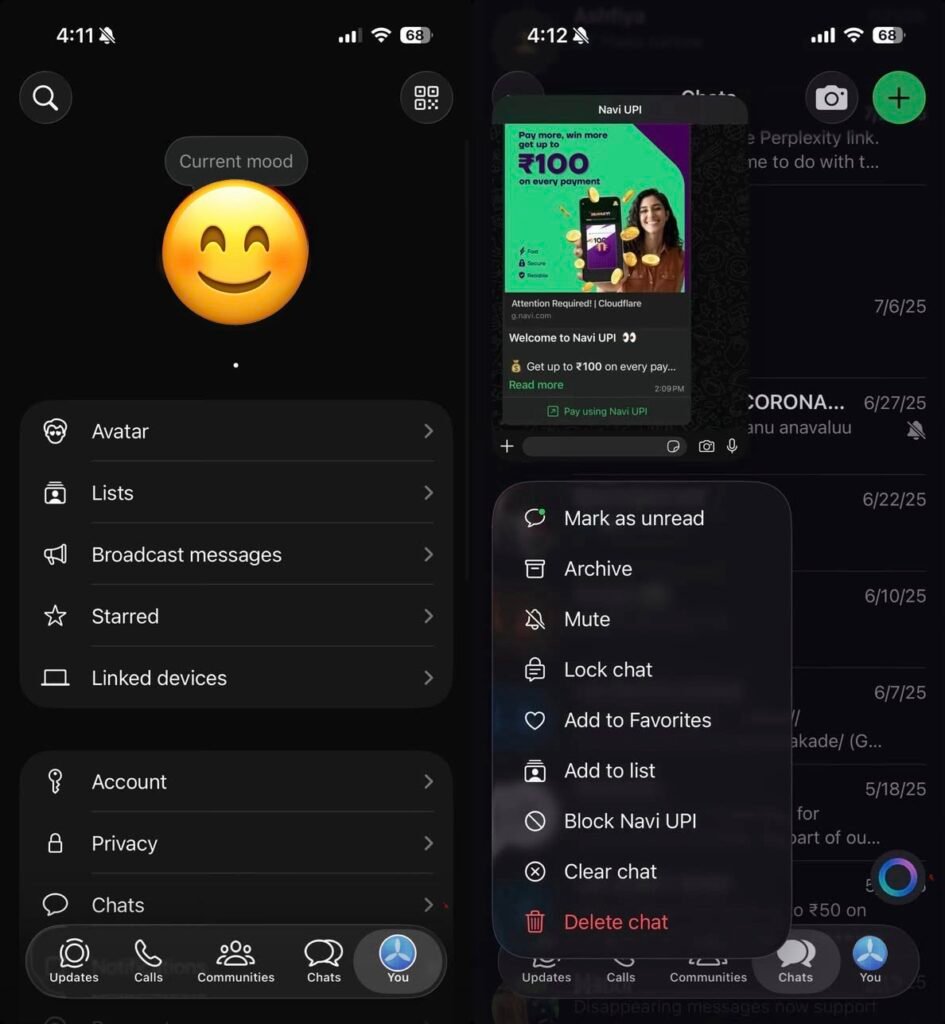
What the Liquid Glass design changes across the app:
• Frosted translucent menus replacing traditional solid context panels
• A glass-style bottom navigation bar that blends with background content
• Blur-heavy overlays in chats, settings, and action sheets
• Floating layered sheets that create a stacked depth effect
• Updated “You” tab visuals using glassmorphism instead of flat cards
The design language aligns with broader mobile UI trends where transparency and motion are used to make interfaces feel lighter without removing functionality.
How the experience feels in daily use:
• Menus appear less intrusive while browsing chats
• Navigation transitions look smoother due to layered blur
• Visual hierarchy becomes clearer through depth rather than borders
• The interface feels more modern without changing core workflows
Importantly, this is not a feature update. Messaging, calls, and privacy controls remain unchanged. The focus is purely on presentation and consistency.
Where the redesign is visible right now:
• Context action menus when long-pressing messages
• Bottom navigation areas across main tabs
• Settings panels and profile sections
• Action sheets such as media options and sharing controls
The shift suggests WhatsApp is standardising a new visual system that can scale across devices and future features.
Why WhatsApp is moving toward a glass-style UI:
• Modern mobile operating systems increasingly use layered transparency
• Visual depth improves readability without adding clutter
• A unified design language simplifies cross-platform updates
• Subtle animation and blur can make interactions feel faster
The update also signals preparation for a broader interface refresh rather than isolated tweaks.
🚀 Need a Shopify Store That Converts?
I build fast, clean Shopify stores for DTC brands that want more sales, not just a pretty site.
What’s expected next:
• Android version is reportedly in development
• Cross-platform consistency between iOS and Android UI
• Gradual rollout instead of a single large redesign
• Possible extension to business tools and community features
For users, the practical impact is visual comfort. The app behaves the same but feels more refined, especially during frequent actions like replying, forwarding, or browsing media.
Performance considerations remain important. Glass-style effects rely on blur and rendering, so optimisation determines whether the interface feels smooth on older devices.
Key takeaways from the rollout:
• WhatsApp is prioritising design consistency alongside features
• The update reflects broader messaging app competition on user experience
• A cross-platform refresh could arrive in phases throughout the year
• Visual changes often precede functional updates built on the same UI framework
The Liquid Glass rollout indicates that WhatsApp is evolving its interface architecture, not just refreshing visuals. That foundation typically enables faster feature development later.
Leave a Reply